Bad Design.
Fall 2022.
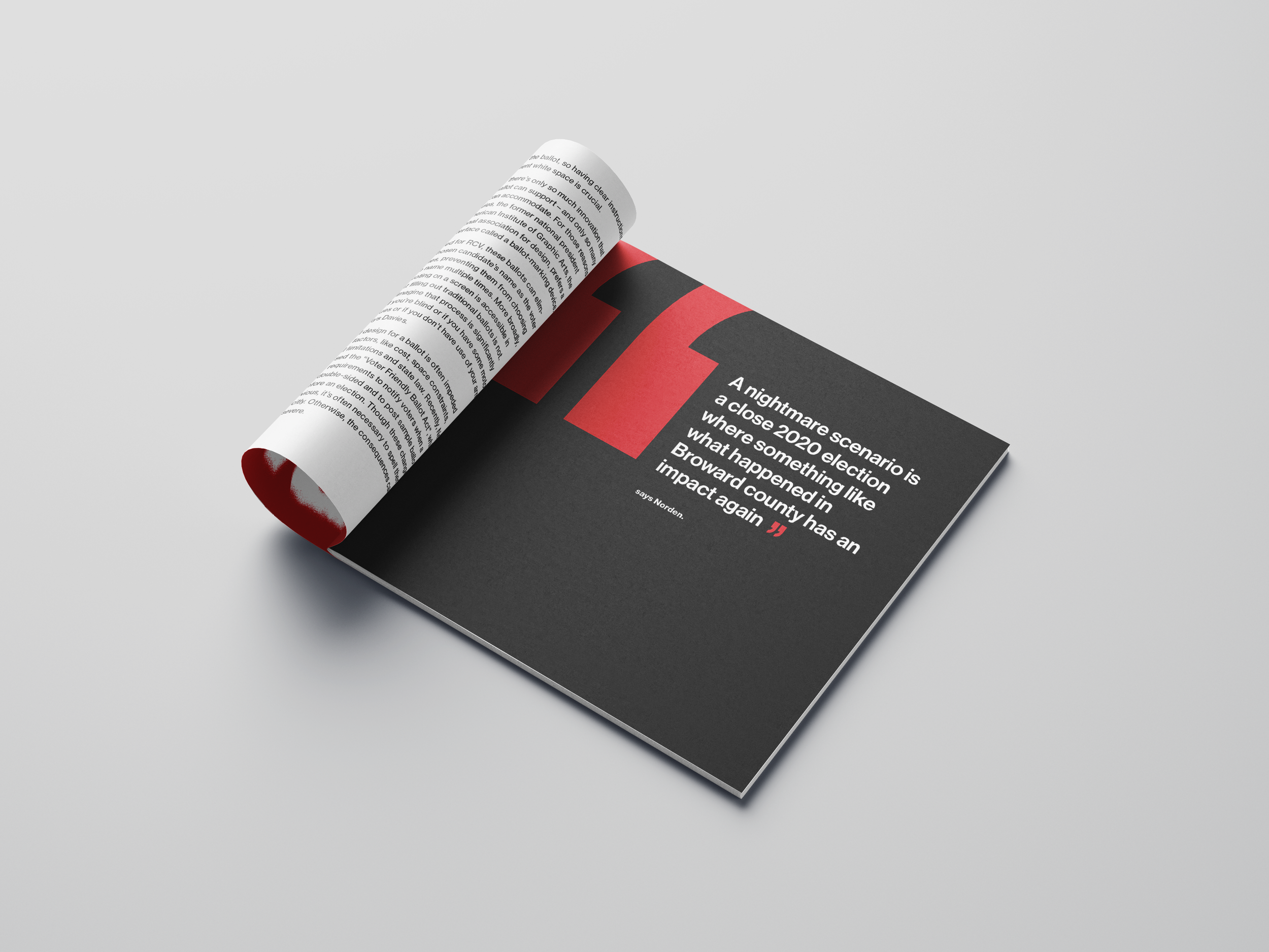
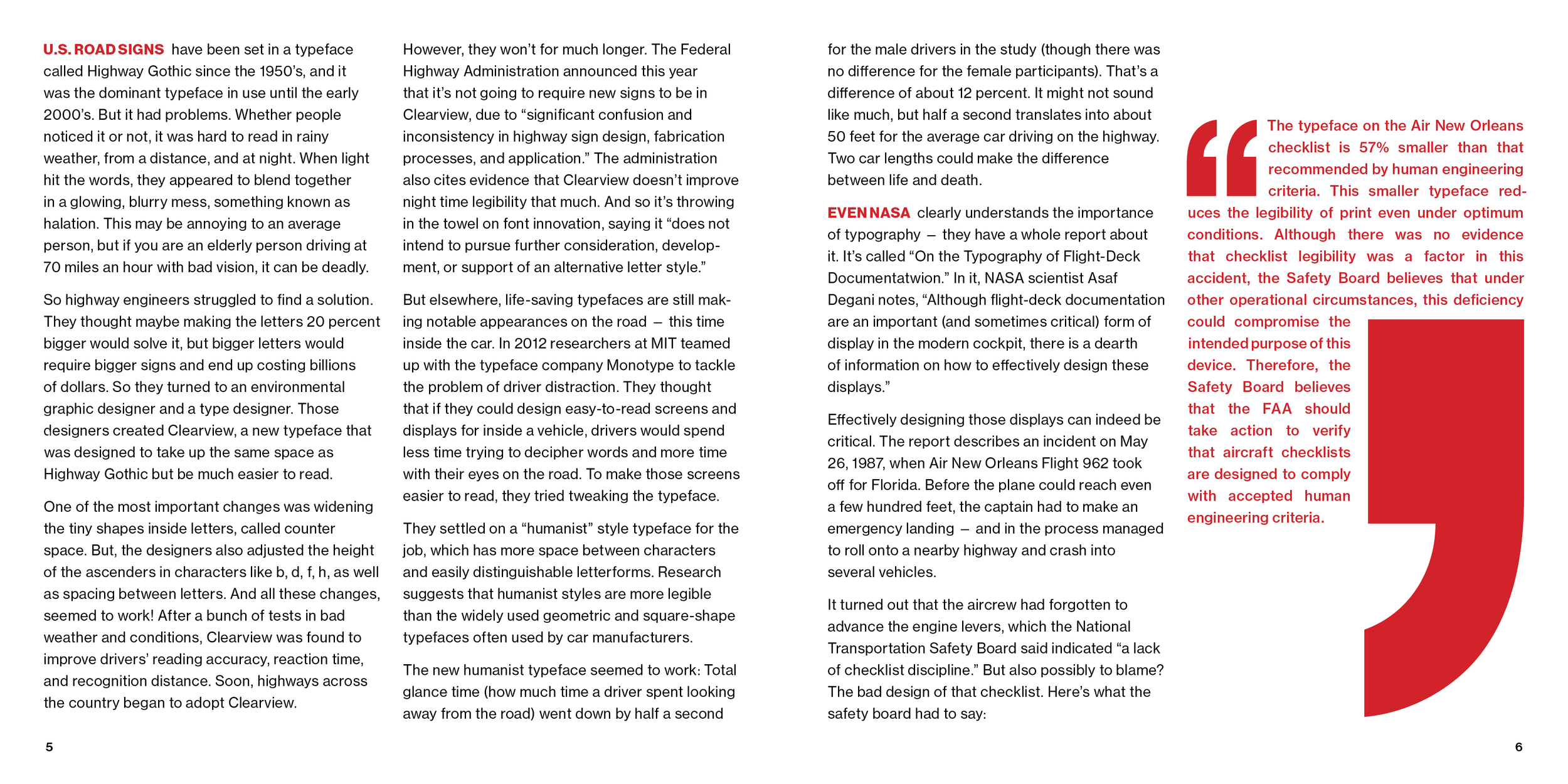
This was designed in Sophia Hodara's Typography I course. We created a publication of three cohesive articles using one typeface, one accent color, and one cohesive grid system. I chose the font Helvetica to display the importance of graphic design and typography choices using three real-world examples of "bad design".


Click through the full publication below.
Enjoy some bad design.


